Project Overview
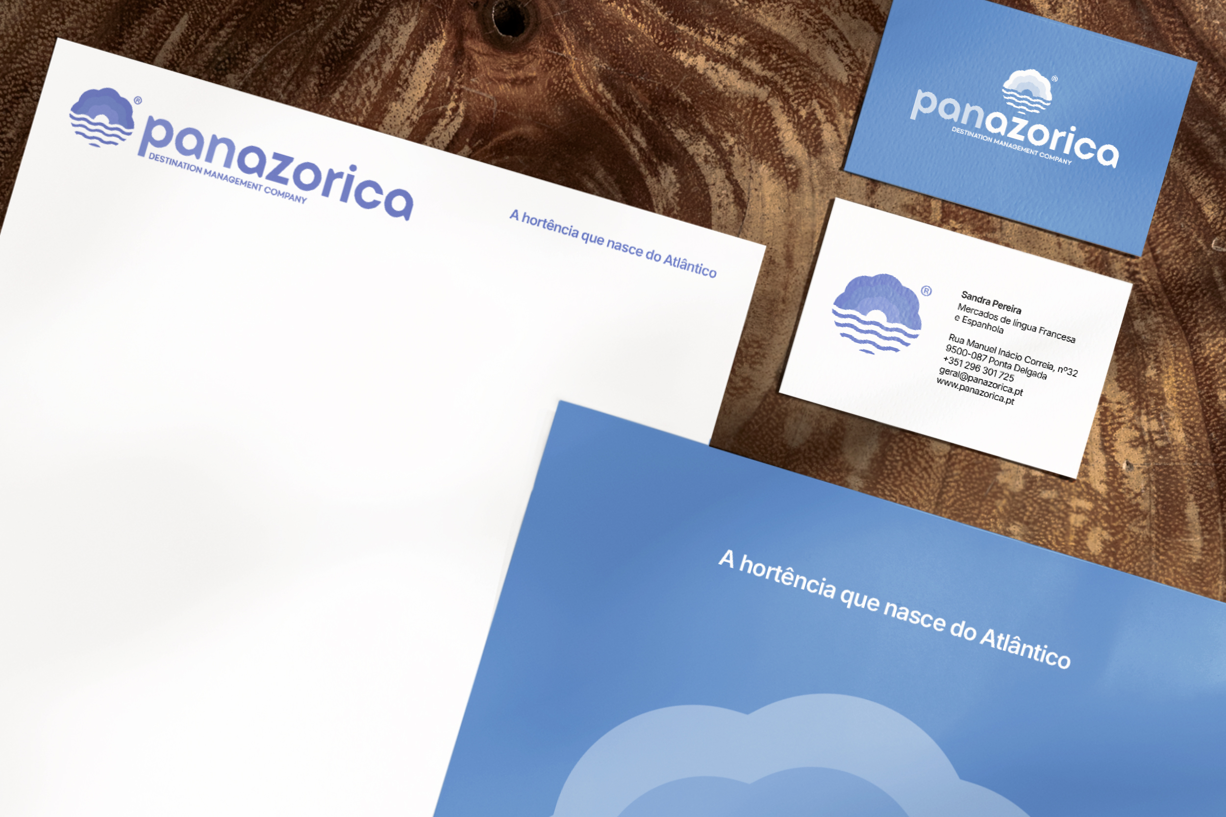
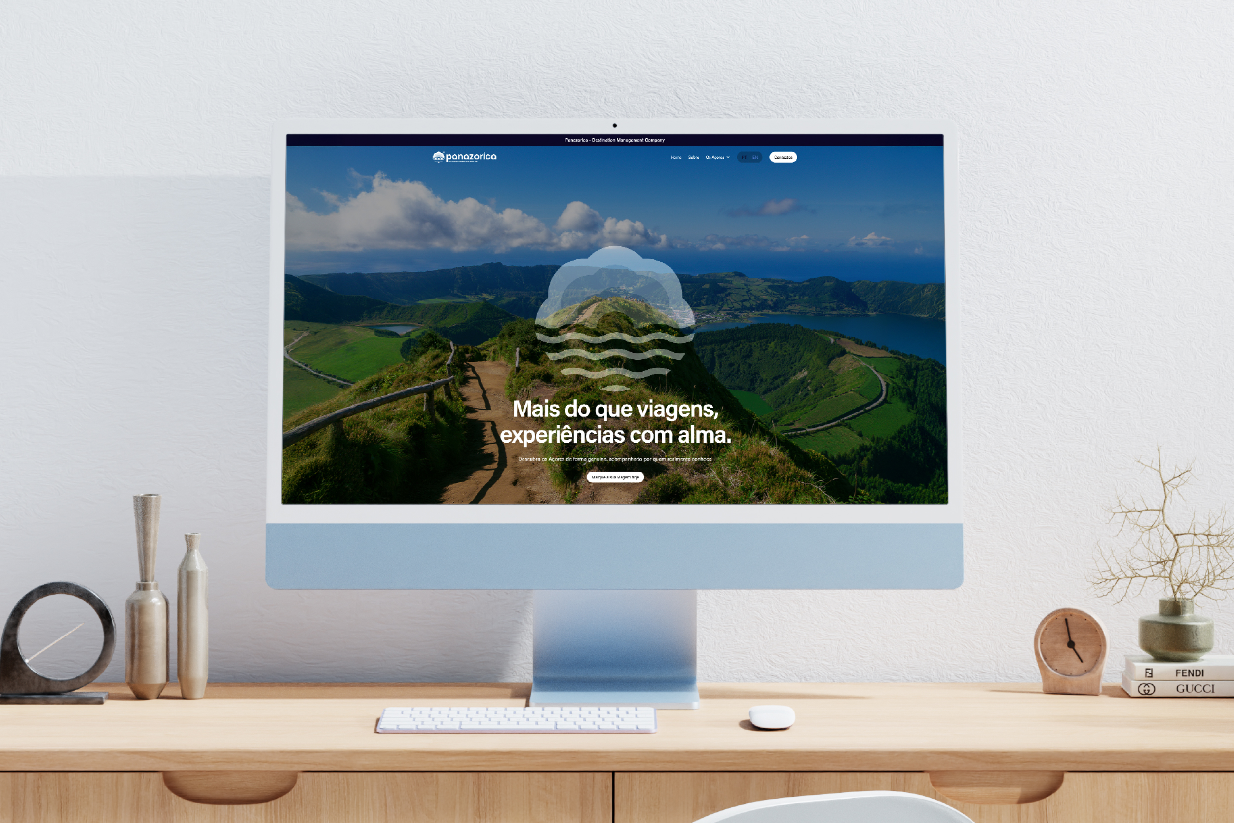
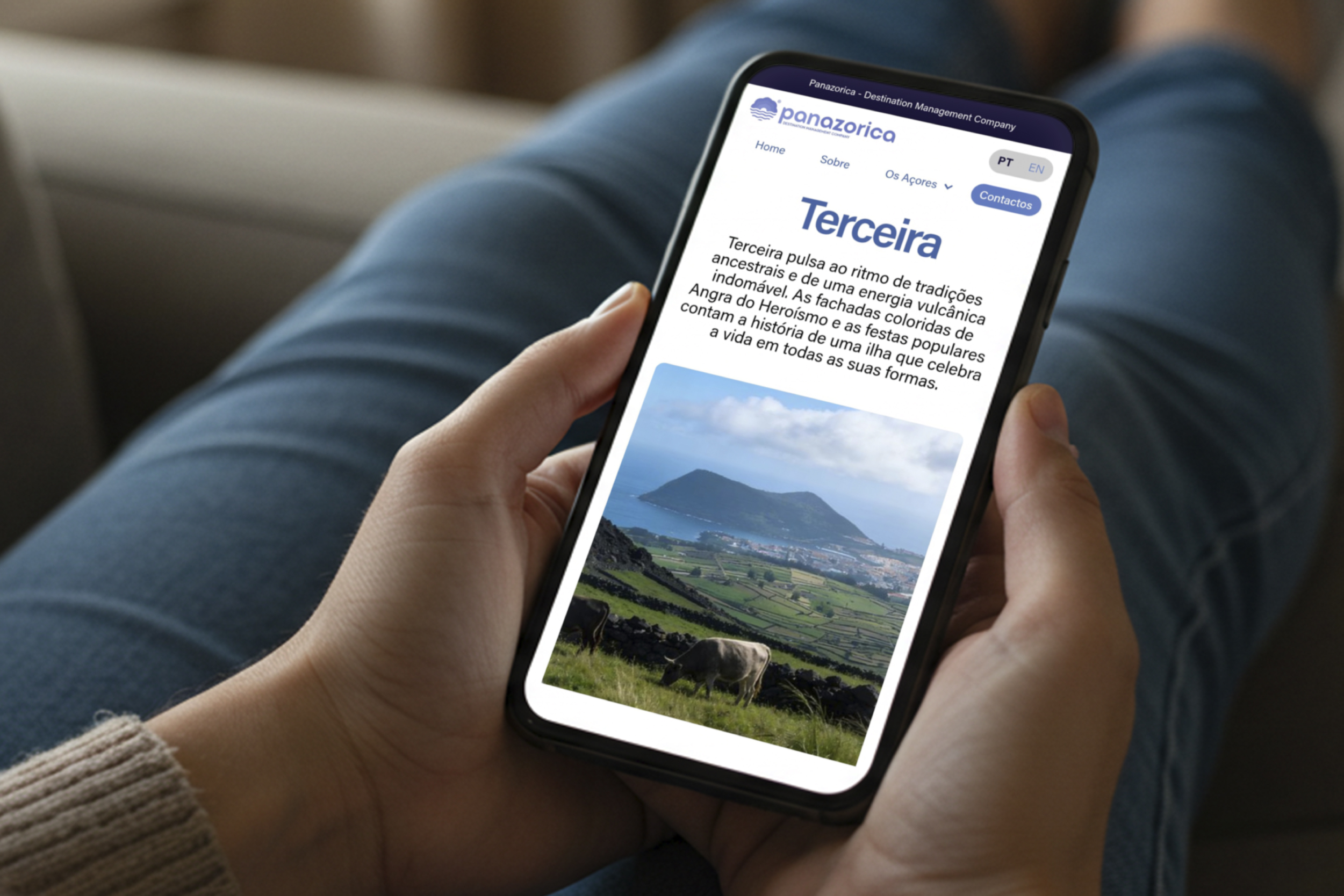
Panazorica is a Destination Management Company based in the Azores, recognized for its local expertise and operational reliability. The challenge was to elevate its visual presence and strategic clarity without losing authenticity. We redefined the brand architecture, clarifying purpose, positioning and tone of voice. The identity system was built around a refined hydrangea symbol emerging from the Atlantic, subtly referencing the islands and their cultural depth. The visual language balances Atlantic blue tones, institutional typography and modular applications across digital, print and fleet. Beyond identity, we structured a complete content ecosystem: photographic direction, cinematic storyboard and long-term social media strategy. Panazorica evolved from a trusted local operator into a cohesive destination brand with international presence and structural consistency.


No items found.